Tuesday, 12 February 2013

Victoria & Albert Museum 6th Feb 2013


1850-1900 - Cotton cloth (left) Hemp cloth (right)

Although I'd seen ikat cloth in images and on the internet, I hadn't really seen any ikat cloth in the flesh, so decided to look in the Victoria & Albert museum collection for examples. I found these examples in the Japanese section, which demonstrate the technique of kasuri, which is a Japanese type of ikat which features indigo dye. Seeing these traditional examples of ikat has given me a greater understanding of the value of this technique as well as seeing it in context and seeing the drape of the cloth in relation to its construction. The patterns are surprising considering the process it takes to makes them and is quite different to any ikat pattern I've looked at so far. 

1920-1940 Ramie woven, Summer Kimono for a woman 

Sunday, 3 February 2013

Textile View Trends

 Folk - authentic textile crafts, decorative jacquards, weaves and knits
 Roots - powerful use of colour, references to contemporary, global, ethnic culture and design, batik prints, Kente cloths, mudcloth and tie-dye textiles, blending traditional materials and crafts with modern solutions, up-beat earthy tones
Intense saturated colours, tactile knits, crochets, vibrant culture, traditional stripes checks and weaves


Trend forecasts for womenswear summer 2013 in Textile View magazine, which show the influence that traditional craft and textile techniques have on fashion despite the growing technologies, traditional techniques are still respected and admired.

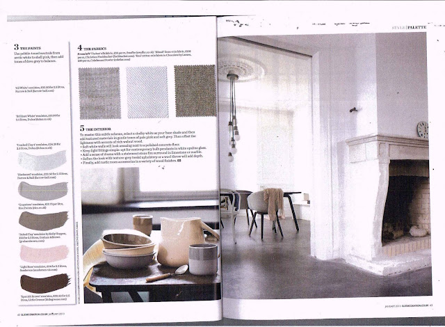
Elle Decor Jan 2013


To get a better idea of what I should be including in my market research report, I looked at existing interior magazines to see how they're laid out.

These pages are taken from Elle Decoration January 2013 and are a really good example for the layout I want to achieve, as it's split into several sections:
1. Inspiration - an image that colours and textures have been drawn from, and that is seasonal
2. Palette - a collage of different surfaces and colours to achieve the particular trend
3.Paints - directory of companies that sell the specific palette
4. Fabrics - different textile samples following the palette, which have surfaces that suit the particular mood of the trend
5. The Interior - tips for how to combine texture, colours and objects to achieve the effect 

While I like the way that this feature is laid out I think it is mainly imagery focused rather than use of text, as my report will use images to support the information that I write about, but it's been valuable to look at existing magazines and understand the structure of trend features like this.

Colour trends


I found these colour swatches from Textile View magazine to get a better idea of the colour palettes being forecast for summer 2013, so I could see if the colours associated with ikat weaving are still relevant and considered on trend. This way I can see if the traditional process and use of colour is sill used in contemporary fashion.

The colours forecast in these swatches are quite rich and contrasting, which seems typical of summer colours, and reflects the colours used in ikat weaving, used to demonstrate wealth.

Saturday, 2 February 2013

Schumacher

http://www.fschumacher.com/search/large/174980.jpghttp://www.fschumacher.com/search/large/67081.jpg
 "F. Schumacher & Co. aspires to be the top-of-mind destination for interior design professionals who value exquisite design, service, innovation, and luxury."

 Schumacher is an interior design company, established in the 19th century that commits themselves to providing outstanding quality and design to an elite market, including the White House amongst other notable residences. They also strive to maintain their family business through generations, given that the comapany is now in its 5th generation. The designers that work for the company bring elements of traditional pattern into modern day luxurious fabrics and wallcoverings. Their ikat/kilim collection shows a variety of fabrics, printed or woven and inspired by Asian ikats. This company demonstrates a translation between traditional methods such as ikat into an elite market in which quality of materials and craftsmenship is key, as well as a refined choice of colours that will suit their wealthy market. In this case the products are mainly bespoke, as they are only within reach to people that can afford this quality


http://www.elledecor.com/design-decorate/trend-alert-ikat#slide-14

I was looking at the impact made by ikat on seasonal trends and found this artcicle from Elle Decoration (published May 2010). Although this article is from a few years ago you can see how the distinctive ikat pattern has been reproduced in a modern way through printing and new technologies, influencing trends for interiors and fashion. The ikat pattern has a nostalgic and folky quality that is quite popular, particularly in summer fashion and interior trends.

Market Research Report Plan


Editors Letter/Introduction:
  • Introduce what you will discuss
    • Process of ikat weaving and the impact it has made on contemporary interiors
  • Overview of what you will discuss
  • What you’re going to do
    • Talk about Designers that use it today and how they have adjusted it in comparison to traditional weavers who maintain the same technique as it originally was
  • Description of subject
    •  Where it originated, describe the process of it and briefly mention how it has changed/maintained over time
  • Introduce issues you will cover
    • Its place within contemporary interiors, especially the process involved

Materials focus
  • Describe the materials that the designers are using
    • Light, cotton, synthetics, synthetic dyes
  • Key materials to the characteristics of the design/topic
    • Traditionally vegetable dyes
    • Cotton, silk

Colour Focus
  • Describe the colours that the designers are using
    • Bright colours
    • Maintain the use of the “blurred” effect achieved in ikat as a way of associating it with the originally technique
    • Colours fall within the standard palette used in Spring/Summer collections
  • Key colours to the characteristics of the design/topic
    • The meaning of colours used in ikat for religious/spiritual reasons
    • Richer colours to demonstrate wealth

Techniques and Processes focus:
  • Describe the techniques and processes that designers are using
    • Print
    • embroidery
    • Hand-dyeing and weaving – like the original method
    • Weaving with new technology, a modern take on a traditional method – fibre optics
  • Key techniques and processes to the characteristics of the design/topic
    • Binding, hand-dyeing, hand weaving, altering design and warp/weft as the weave progresses, finishing process, double ikat
    • How modern designers make shortcuts to achieve the same effect using modern technology e.g. printing
    • The process means that the making is very time consuming in a throw away society – why designers make shortcuts – and if the process is followed it is applied to a bespoke, elite market – means that the outcome is worth more, customers can have more control of what they’re paying for, the result is completely unique to them

Market analysis:
  • Market for designers/subject
    • Interiors
    • Fashion
  • Contemporary examples of a traditional technique or process
    • Designers use process as a basis but apply a modern twist, such as weaving in fibre optics
  • Bespoke/commissioned or mass produced?
    • The traditional method is time consuming so would typically appeal to a bespoke market, which gives the customer more control over colours, weave, texture etc
    • The adaptation of the ikat process made by printing it, means that it can be mass produced, using the typical designs and patterns to create the impression of ikat, in products like wallpaper, fabric, furniture, upholstery
  • Handmade or machine manufactured?
    • Traditional method is usually handmade by skills craftsmen, possibly from regions where the process originated, who each are skilled in a particular stage of the process
  • Where does it sell or show?
    • Products advertised in journals like Elle Decoration, World of Interiors, fashion influences in journals like View, Textile Report
    • Usually priced highly, aimed at a wealthier audience, shows the extent of the quality of the outcome, as well as the craftsmanship gone into making it and time taken

Observer/conclusion:
  • Description of the designer/subject
  • Views/opinions of the subject
  • Origins of it
  • Influences of it
  • How you might use it/be inspired by your designers/subject?
    • The concept of using resist to create imagery and patterns
    • Putting modern twists on a traditional technique

Monday, 28 January 2013

Luke Irwin

Luke Irwin is a textiles designer notable for the manufacture of hand-made bespoke rugs, aiming to give the customer complete control of the colour, texture, size & weave of their rug, ensuring that the finished product will suit its intended context. Each rug is hand-knotted maintaining traditional techniques from Nepal and India and each stage of the manufacture is carried out by skilled craftsmen, the drafting, casting, weaving, washing and hand finishing and because of this each rug can take between 12 to 18 weeks to complete. 


The fact that he strives to maintain traditional techniques, sets him apart from other designers as they try to incorporate new technologies and put their own twist on a traditional process. He also goes against the idea of mass production, allowing each customer to have complete control of the design of each rug, giving each rug individuality and providing a personal service to his customers.

Source:http://www.lukeirwin.com/about-us/

Sunday, 27 January 2013

Market Report Topics

There are a few different topics that I've been thinking about looking more into to write about for the report after looking at these different artists and processes:
  • Is there a market for processes such as ikat weaving in contemporary interiors/fashion?
  • The impact that traditional textile techniques have had on contemporary trends and style
  • Colour theory traditions that have survived/impacted modern style
  • Impact of colour on moods and atmosphere 
I think I need to collect more information around traditional processes and use of colour historically and in a contemporary sense, so that I have a clearer idea of the area I want to look at in more depth.
 

Madeline Weinrib

Madeline Weinrib is known for her vibrant use of colour and Fabric designs which she is able to bring into a contemporary context for interiors. All her ikat fabrics are hand-dyed and woven in Central Asia, showing a loyalty to the original techniques used to create these extraordinary patterns


Astrid Krogh

Astrid Krogh's work in particular shows how the ikat process has developed through generations and into new technologies. The video shows a 'light tapestry' made of paper yarn with organic patterns created in optic fibres, and refers to the ikat weaving technique, which she has interpreted by using light as an imaginary dye. The light creates its own patterns and shapes, making gradual transitions between colourways and giving the textile life and movement. Her work is a great example of how the methods of ikat are still used in contemporary textiles and how the patterns are being reinvented using developing technology.
 
A close up of the patterns creating on the optic fibres by the constant transition of light 

Source: http://www.nothingintosomething.com/blog/ikat-light-tapestries-by-astrid-krogh
 

Gunta Stolzl

Textile design 1929 29.5x20.3 cm  Misawa Homes' Bauhaus Collection, Tokyo
Design for a wall hanging  Bauhaus Dessau, 1925/26  15.9x15.9 cm  Victoria & Albert Museum, LondonDesign for a detail of   "Slit Tapestry Red-Green"   1927/28   31x24 cm  Private collection 

I wanted to include Gunta Stozl's work because of her unique drawing style, which is especially useful for transferring imagery into weave and fabric patterns. Her work is largely influenced by her experience in the Bauhaus and the artists associated with this movement, such as Wassilly Kandinsky & Paul Klee, as you can see elements of their style has come through into her work. Another element of her work that particularly appealed to me is her use of colour and proportions, used specifically to portray the landscapes that inspired her over her career. Her style of mark making and use of colour has inspired me to look at my imagery in a different way and be able to transfer the arrangements of colour into a woven or knitted piece.
Jacquard wall hanging "Damast" 1930 130x73.5 cm  Victoria & Albert Museum, London

Sunday, 20 January 2013

 
I found these ikat inspired pieces for interiors, which made me realise how the pattern has influenced different contexts of design as well as being used in print and stitch, seen in my own bed linen! (see below)
Ikat

Tuesday, 15 January 2013

Ikat process


Design transferred onto threads

Parts to not be dyed are bound tightly with plastic

Thread is dyed, air dried, then some areas are untied to be dyed again

Ties removed from the dyed thread

I wanted to look at the preparation process for ikat and that in itself is quite beautiful and interesting before it is even woven, and involves many skills from different people often in different villages.

Images showing the binding and dyeing process of ikat in Bali, Indonesia
Source http://iweb.tntech.edu/cventura/ikat.htm
 

Ptolemy Mann


Ptolemy Mann's work first stuck my eye because of her bold use of colour and unusual combinations of colour. She is a woven textile designer known for her use and knowledge of colour. All of her textile work is hand dyed in her signature ikat style and hand woven on a 'Dobby' loom, then stretched over frames and placed within public, corporate and domestic spaces. Her textile installations are created with their intended location in mind, using surrounding colours and scenery to directly inform the colours and form of the piece. Her understanding of colour theory enables her to create pieces that suit its context and evoke particular feelings from the viewers. For example her collaborations with architects and interior designers as a colour consultant means she has had to develop colour palettes for buildings such as hospitals. For inspiration for the hospital's exterior facade she used the surrounding scenery, leading her to use blues and greens to help connect the building to its location. The colours are also used for practicality as well as for aesthetics, as the colours are blended to gradually guide people to a certain building section, e.g. one of the towers was green, so surrounding buildings will have more green on them building up to the tower to lead people towards it. This shows that Mann uses colour as a tool as well as for decoration particularly in terms of psychological well-being in health care environments as she's interested in the way that colours can impact people's health and mood. An example of this occurred in a US hospital where many visitors felt unwell after spending time there due to a specific shade of lavender that was used throughout the decoration of the hospital. After the eye has had a concentrated burst of a single colour the optic nerve triggers an image of the complementary opposite colour, which in the lavender's case triggered an image of the colours of vomit and bile which caused people to feel unwell. Mann's aim is to create areas of optimism within these buildings by using colours that trigger good moods and health.

Mann's practice of stretching fabric over a frame originated in her studies at the Royal College of Art which tutors thought would diminish the fabric's drape and fluidity but in fact led Mann to explore the architectural aspect of textiles and consequently to collaborations with architects, where she has applied her knowledge of colour and texture to places and projects where textiles were not used at all.

Source http://www.ptolemymann.com/art_statement.php
http://www.ptolemymann.com/design_statement.php

Looking at Ptolemy Mann's work has opened my eyes to the concept of colour theory and how much of an impact it can have on your work and the reactions from viewers. I think I'd like to look at colour theory in more detail, and how it's used in textiles now and historically in different cultures and the meanings and feelings it can evoke.


I'd been interested in the process of ikat and the amazing patterns created by it but hadn't realised the amount of time and effort that goes into the ikat process; binding the warp or weft, dyeing it, dressing the loom then having the adjust the yarns as it is woven to create the desired pattern.